Playing with Color in your Mind's Eye
Easy ways to simulate yarn color mixing before starting to knit or crochet
by Jackie E-S
What might yarn colors really look like when knitted?
Do you see a ball or skein of multi-colored yarn in a shop (or catalog, or web site, or vendor market, or whatever), and wonder what it will look like when it is knitted up? Especially if there are no knitted samples available to compare? Or you want to come up with your own color combination of yarns from colors in your stash for a multi-colored garment?
I use a couple of simple ways to help me approximate how the yarn colors *might* interact when knitted. It doesn't avoid the recommendation to sample. But it can serve as a quick pre-sampling step to help eliminate those possibilities that don't "feel" right. A caveat – this is not a scientific treatise on color theory and is intentionally kept very simple – just fun stuff.
The basic principle this pre-sampling color test relies on is "visual color interaction" – our eyes mix colors to more or less an extent, and perceive blends. Larger areas of color look more distinct; and smaller areas of color will appear to blend into new colors, or colors will become more or less prominent, etc.
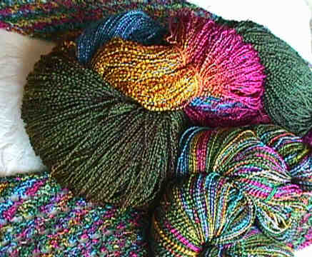
To demonstrate this principle, here is an example of how colors might be viewed in 3 different ways:
- the skein as dyed so that there are larger areas of color
- a skein rewound so that the colors are in smaller areas
- the yarn as knitted (using the pattern #A60 A Beaded Bias Towards Lace Scarf)
I use two methods to visually test yarn colors that are still in skeins or balls. I'll call them squinting, and fragmenting. These work with either multi-colored skeins of yarn, or with balls of solid colors arranged in approximate proportions to what you anticipate using.
Test 1 - Squinting
Step back from your yarn display, and squint through narrowed eyes. If you are like me and are near-sighted, just take your glasses off!
This lets my eyes discern contrast. A color mix with high contrast would be more suitable for a simple stitch pattern where the color was the design feature. A color mix with very little contrast i.e. tone-on-tone, would probably be more suitable for a highly textured knitting pattern or for lace.
You can also use red or green filters such as cellophane paper or the special plastic filters sold in quilting supply stores.
Test 2 - Fragmenting
Even if there is high contrast with a color mix viewed in large areas, there could still be a "graying down" of those same colors when knitted due to breaking up of the color into the stitches. To quickly simulate this, look through the opposite ends of binoculars.
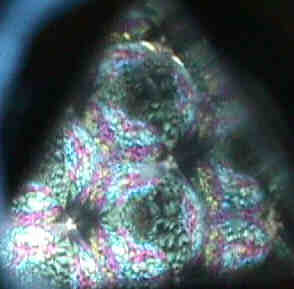
Or use a teleidoscope – This is similar to a kaleidoscope in that it is a tube that you look through and see beautiful prismatic color combinations. The difference is that a teleidoscope uses the colors of the world (in this case, your yarn!), to fragment into prismatic glory.
Note: For more on teleidoscopes, check one of the internet search engines such as Google.
Although the view through the binoculars or teleidoscope doesn't look like knitted stitches, it does give an idea of how the colors will look when they are scaled down, or broken up into smaller areas such as when yarn is knitted.
|
Just to give you an idea – Here is a view through my teleidoscope of the skein of yarn shown above (as closely as I could get
it with my digital camera).
|

|
We all perceive color slightly differently. So what you see and feel about colors is the only right answer. Have fun with color to explore your personal self-expression!
Return to Index of Jackie E-S Articles & Tips.
| 